Supp, gang?
Here’s the landing page science we used to get you subscribed.
But worry not, you signed up for the good stuff.
So take a notepad, write down the formula & boost your signups, too.
If you are ready for the breakdown, then so am I. Let’s do it.
Above The Fold
This is the part of the landing page you see before scrolling. We divided it into five chunks. Let’s work through them piece by piece.
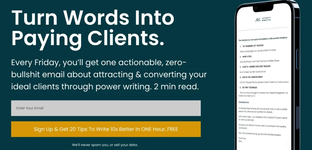
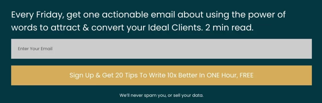
1. Naked-Benefit Headline
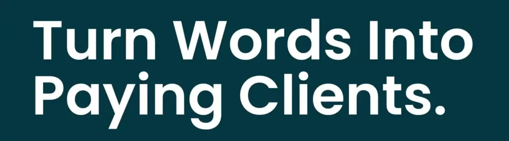
What is your Target Audience’s greatest perceived benefit? Write it down. That’s your headline.
In this case, the whole point of writing online is getting paying customers. That’s the outcome our Target Audience wants. Hence the heading.
2. The Explainer
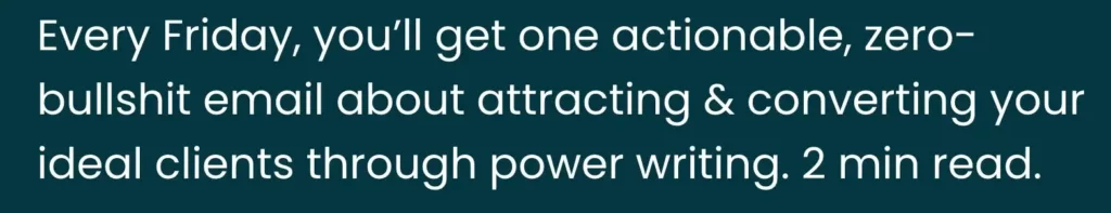
In one sentence, clearly explain to your Target Audience what they’re signing up for. Let’s dissect this example.
- When? “every Friday”
- What? “one actionable, zero-bullshit email”
- Result? “attracting & converting your ideal clients”
- How? “through power writing”
- Time commitment? “2 min read”
3. Email Capture
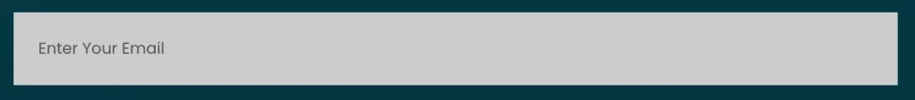
The most important advice here is to make the email capture as simple as possible. Don’t give people any extra work. First names, last names, pet names…forget about it. Asking for their email is already big enough ask.
4. Call-To-Action (CTA)

Ok, now that your prospects have entered their email, you want them to hit the CTA button. The rule of thumb is keep your CTA below five words. But sometimes, rules are made to be broken.
This time, we wanted to reward you, our subscriber, by sending you an ebook that helps you become a better writer, at no cost. (Hopefully you took a peek, it’s a gem.) That’s why our CTA button surprisingly (wtf) has 14 words in total. This is the first time I’m actually counting it. But hey ho, it still works.
5. GDPR

Adding the GDPR below your CTA button might seem small and insignificant, but don’t let its size fool you. The promise behind is very, very powerful. If you can keep it, congratulations. You just gave your audience an extra nudge to subscribe to your newsletter.
Now let’s scroll down.
Below The Fold
This is the part of the landing page that a reader must scroll to see. We’ve split it into three segments.
1. Social Proof
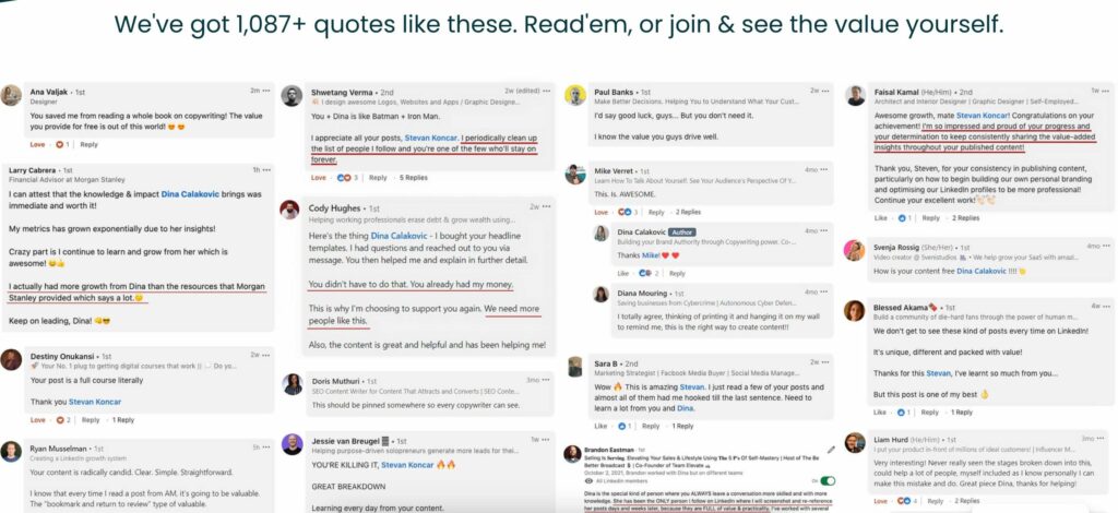
If anything can persuade a reader to take action, that’s social proof. See what we did here?
- We said we have over 1,087 quotes like these. Not 87. One thousand, and eighty seven. Quite a number.
- We screenshotted the testimonials, instead of quoting them. Screenshots always appear more trustworthy.
- The total number of screenshots on the landing page is around 50. Of course that nobody’s gonna read them all, but seeing so many of them in one place will make your readers think, “Holy shit, this must be good”.
2. Final CTA
After scrolling through all the screenshots, you need one more CTA button at the bottom of your page. Why? Because you don’t want to make extra effort for your reader by making them scroll all the way back up to subscribe. Not a good idea.
So repeat the Explainer one more time (tweak the wording like we did here), then add an Email Capture, CTA and GDPR from above. Leave the last three with the exact same wording. Consistency here prevents you from confusing the reader.
3. Risk Reversal

Last but not least, communicate loud & clear that your subscribers can unsubscribe at any time. We’re all traumatised by email lists that made it hell to unsubscribe, so make sure yours is not the one. Then say it.
Alrighty then.
We’ve scrolled through the end. Now you know how to maximise Newsletter signups, and I’m already late for the gym. So I gotta get going.
But the point is – use this advice. And don’t forget to make this day amazing.
Later, Alligator.
Love,
Dina